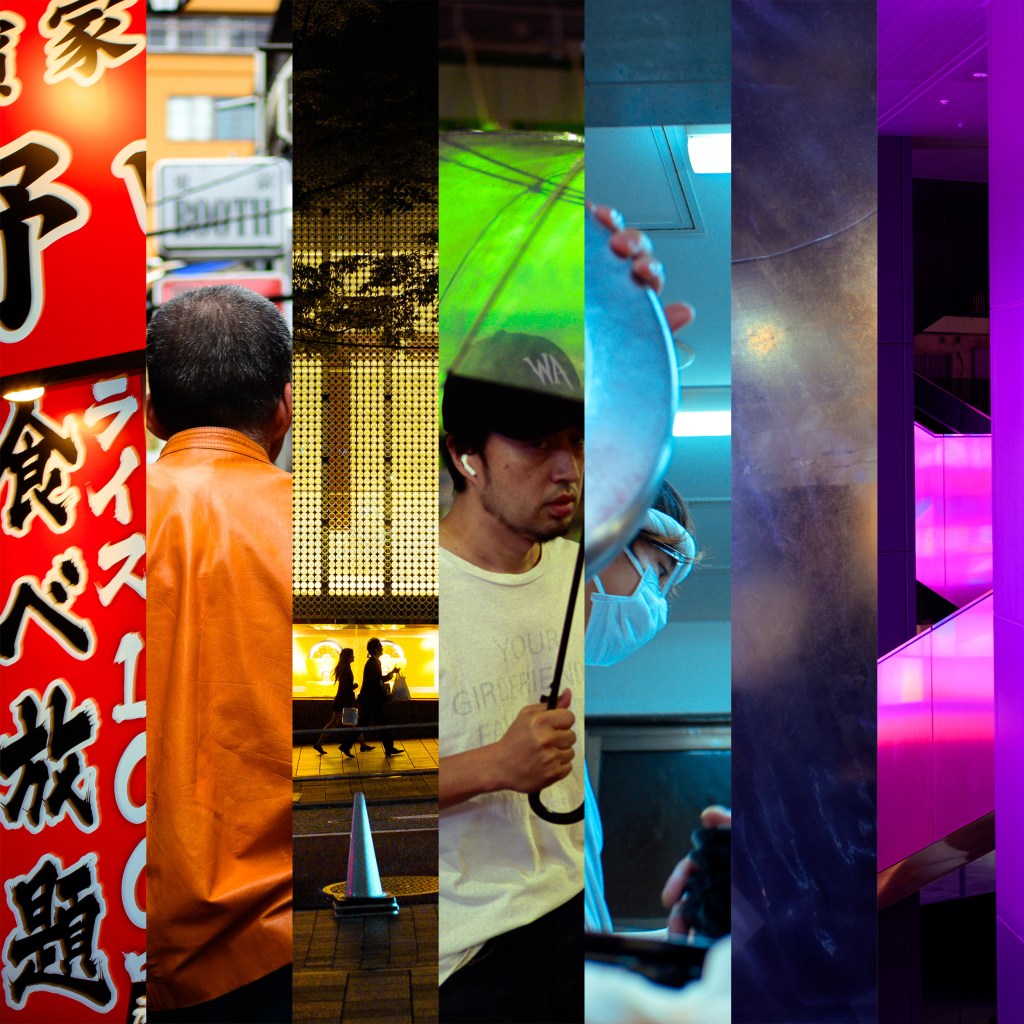
In a recent series of Instagram posts, Joel Meyerowitz created sets of images organized around the colors of the rainbow.
I was captivated by the simplicity of the idea. Each set highlights all seven colors: red, orange, yellow, green, blue, indigo, and violet. One example, and my personal favorite, can be seen here:
https://www.instagram.com/p/DWG5v_fEZ8T/
The concept stuck with me. So I set a few constraints for myself and dove into my own archives to see what I could find. To keep things focused, I limited the project to images made with my Nikon Zf during my trips in Tokyo, Japan.
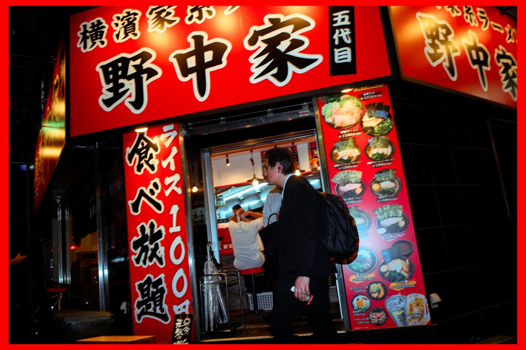
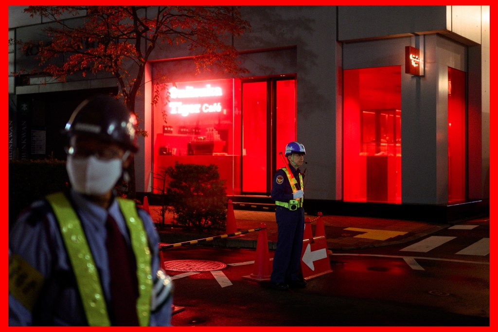
Red
Tokyo features a lot of red, but finding it dominating a scene is tricky. The first one was shot with a flash to illuminate the subject, but this scene is really about the attention-grabbing exterior of the small soup shop. This restaurant certainly grabs one’s attention! The bottom image is from the Ginza location of Onitsuka Tiger. The red glow from the interior lighting spills out to the intersection outside.
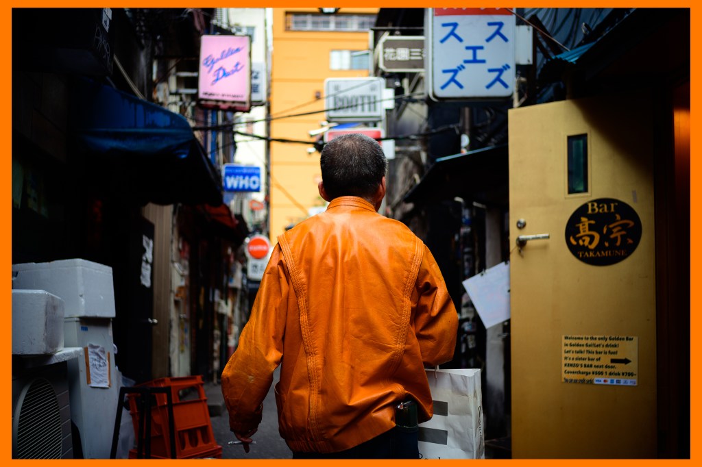
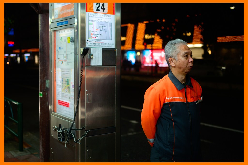
Orange
Orange is nuanced because a lot of scenes have warm hues but lack a specific orange pop. These two images feature tangerine-toned clothing. The first photo was taken during the quiet daytime hours in Golden Gai. By night, these dense alleyways become much busier due to the 200+ bars located there. The second photo balances an orange jacket with the orange bokeh in the background.
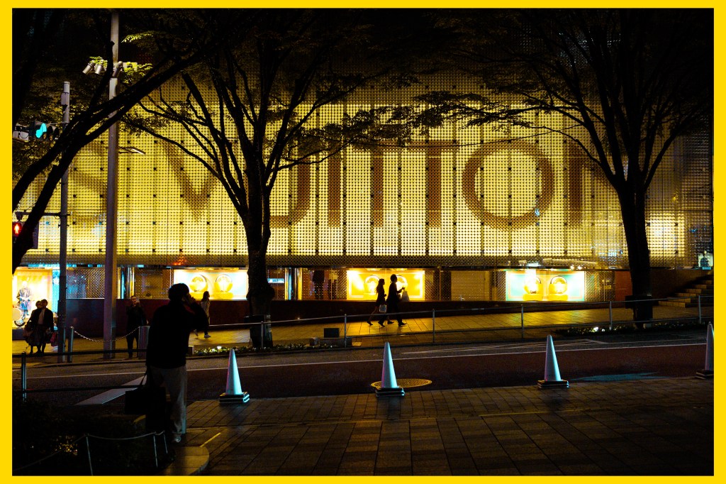
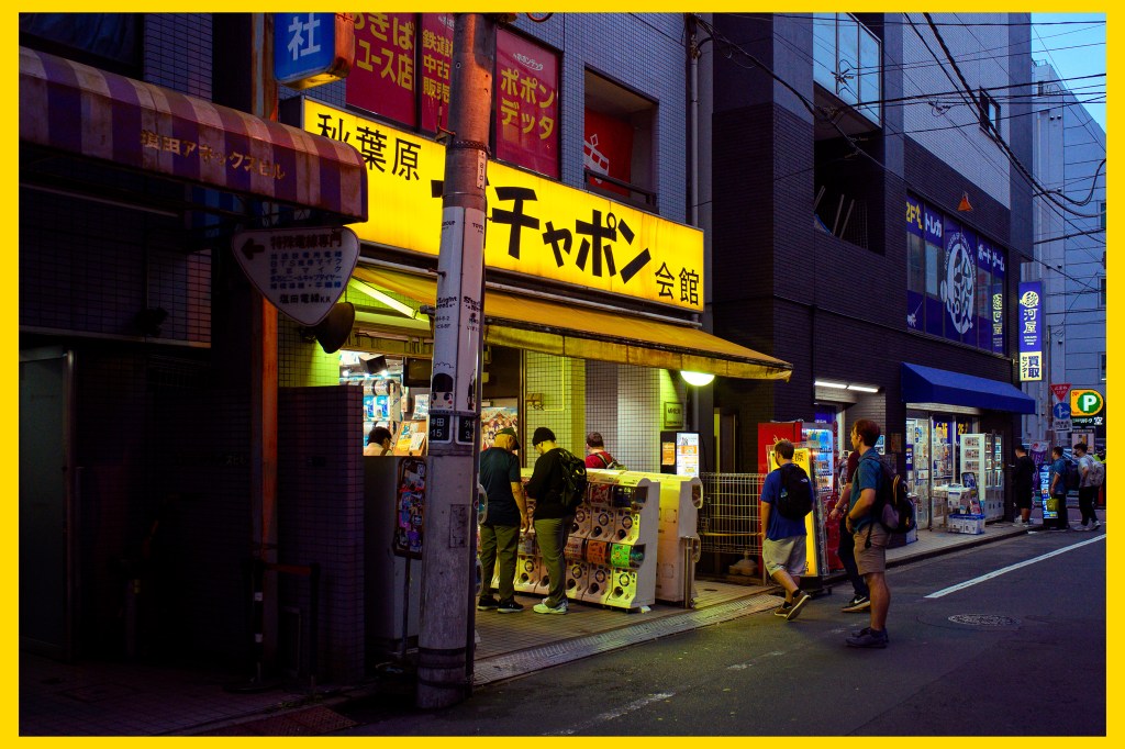
Yellow
I need to look for more yellow in my photography, as I took the longest to find suitable options from the Tokyo archives. I apparently tend not to shoot much yellow and want that to change. The first image required some fairly heavy color grading to turn a Louis Vuitton storefront from a warmer orange to a cooler yellow. With the second image, the yellow light of the gashapon shop sign pops off the screen. Although the image features a blue hour sky, the eye immediately goes to the lemon yellow.
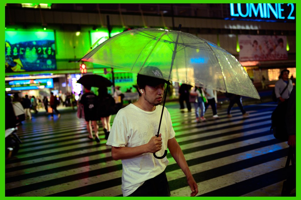
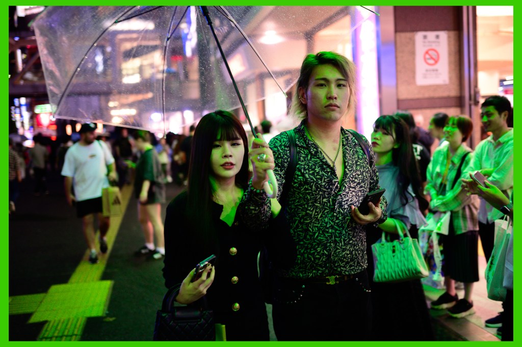
Green
The commonality of these two night scenes goes beyond just the green colors. The transparent umbrellas featured in both scenes are quintessential Tokyo on a rainy night. These pair seamlessly.
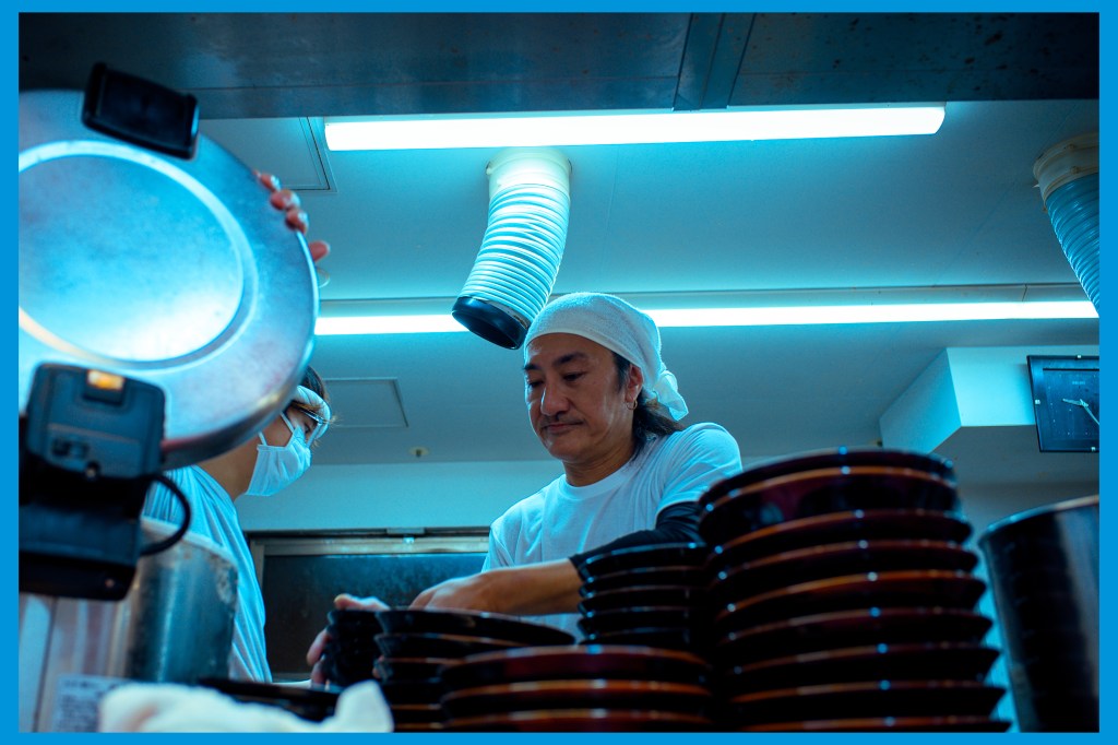
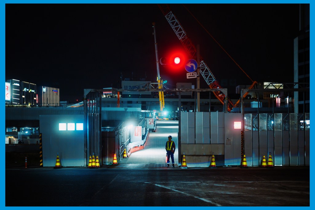
Blue
Image one was made during my first-ever meal in Tokyo in October 2024: ramen. The chef was working on my meal while I was snapping some photos of the bustle of activity in the kitchen. The second shot highlights just how much construction is going on in Tokyo. It is amazing. A worker is quietly keeping watch over the entrance deep into the night. Interestingly, upon inspecting the EXIF data, I noticed both of these frames were made on that same first-ever night in the city.
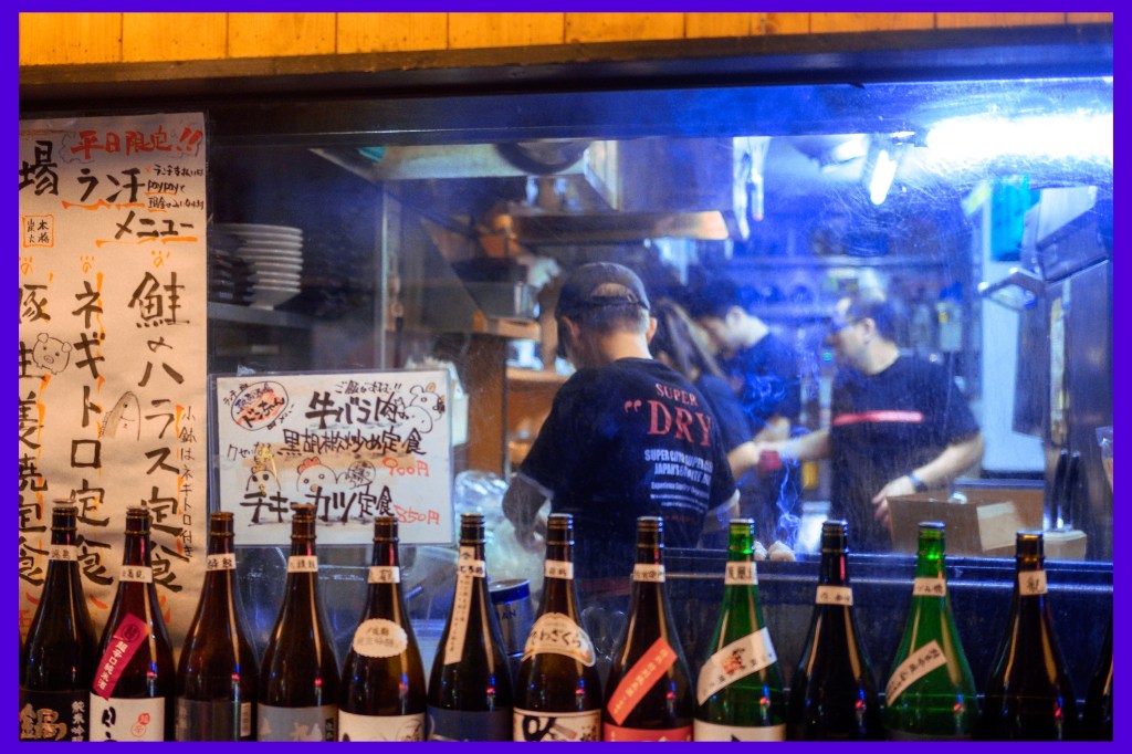
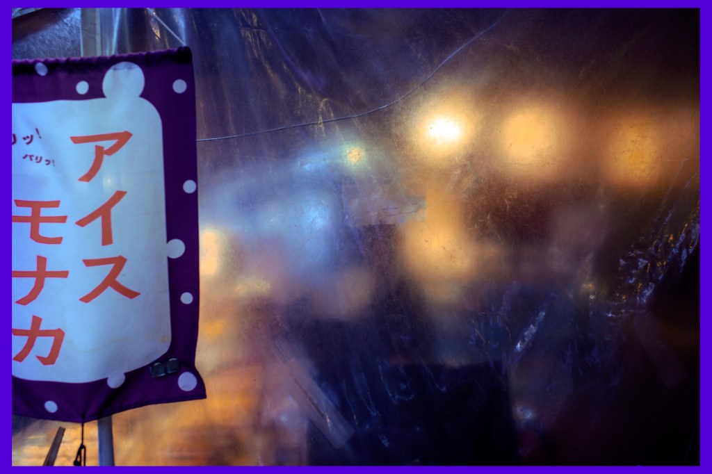
Indigo
These two are more abstract in nature. The first one is shot through some hazy glass into a kitchen in Shinjuku. The second one has a swirly color palette created by a thick wrap of plastic around an outdoor seating area.
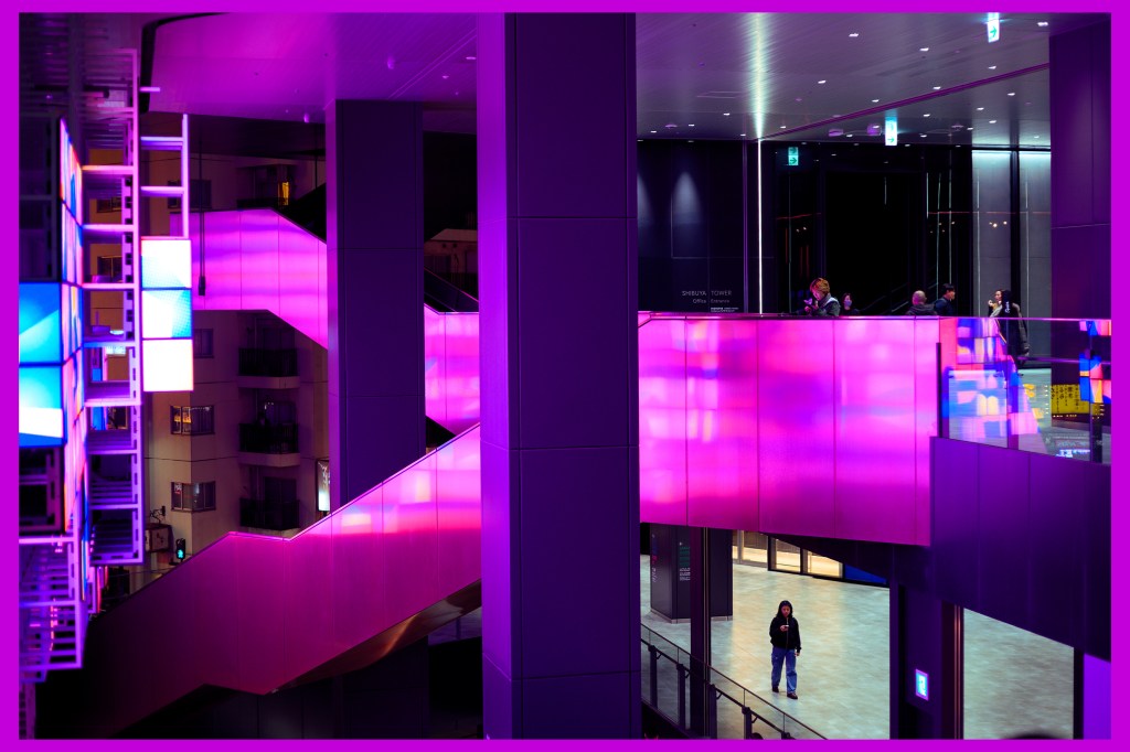
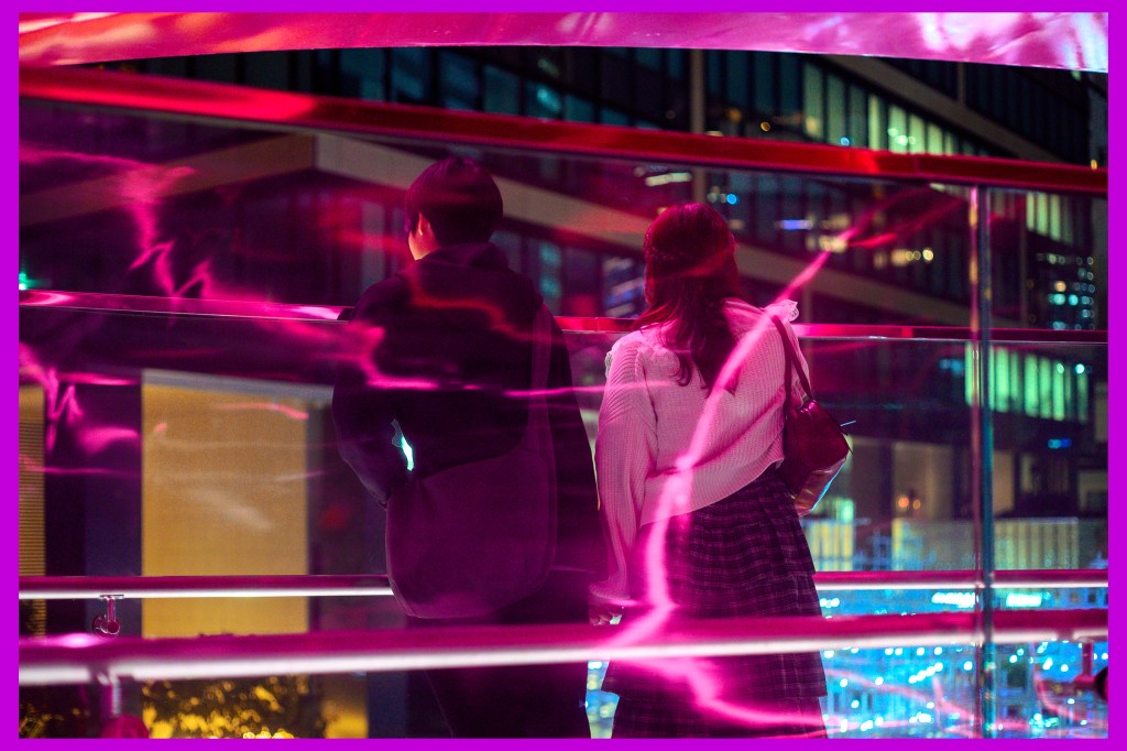
Violet
These were taken on the same night in Shibuya. This hyper-modern area near Shibuya Station features all the cyberpunk colors and architecture one could want. The vivid violets dominate these frames.
Curating Can Be Fun?
I find image curation to be a real challenge. I struggle to pair photos in a way that feels intentional, because I don’t want my work to be seen as a weak collection instead of a series of strong, individual images. At the same time, I understand that when images share a common thread and are experienced together, they can reinforce one another and create a more compelling narrative. Developing this balance is something I want to focus on this year. Small challenges, like the one from Joel, have made the process more enjoyable by introducing clear yet creative constraints, helping me revisit my unposted work from Tokyo with a fresh perspective.
